Two years ago I wrote a short TomTom Europe review. It is time to check what has changed in this application and how it looks now. You can download an application from Google Play and it is freemium model. If you don’t buy a premium version with in-app purchase, it offers 70 km free per month. It will reset every single month, letting you have access to TomTom’s premium features for that stretch of travel without having to pay anything towards them. Some of the premium features that you can find in the TomTom app include locations for speed traps, updates on traffic…
+ As I expected, TomTom offers very good maps and route navigation.
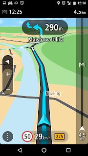
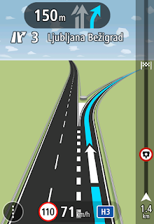
+ Application is fast, with pretty good and clean user interface and very nice navigation view. It sets a high level for all other navigation applications. Without any troubles it zoom in and zoom out while you drive. Application is written well and don’t eats all your battery and don’t warm your phone over the limit.
+ It is very accurate and without delay. Navigation don’t sticking and if you change/miss a road, it recalculate fast with good suggestions.
+ Safety cameras, dangerous zones, live traffic … available for everyone. Even on freemium model.
+ TomTom now offers TomTom Traffic service for Slovenia. It provides real-time traffic information. Their service is known as very good and from this spring they add some new services: Turn-Dependent Jam Information, Dynamic Speed Limit Messages, Weather Influenced Predictions and Road Condition Monitoring. Don’t expect to see on map how dense the traffic is. There are only information when something is going wrong. On the other hand I was surprised when I compare TomTom Traffic information with other providers (Here, Google …). There was many differences and it is hard to tell, who has the best Traffic information. At least in Slovenia where traffic service in navigation is quite new.
– I noticed that TomTom still offer only stupid collections of maps. There is no way to tell TomTom that I simply don’t need the whole Europe map and that my phone doesn’t have enough space for it. After some thinking I decided to install a collection of Eastern Europe – but now I don’t have Italy where I drive quite often. But hey, I have the map of Russia. Maybe I will go to check some Siberian roads in next weeks … in my dreams. TomTom – I don’t need the smallest road in Omsk on my phone.
– Can’t combine searching for address and showing on a map. It is nice feature from IGO, where I can search for a street and it shows a result on one side. Then I can use a finger to pin a location on map and set this to destination point.
– Approaching to roundabout don’t show which exit you will have to take. It is very convenient to tell driver to take 3rd exit for example and then he has this important information before the roundabout.
– Route bar is always shown on side when you using navigation. Maybe it is interesting to someone, but it is a waste of place. I didn’t find any way to remove it from screen.
– Annoying background when using settings. The background is very transparent when user opens settings. This results in bad view, especially when sun shines on your screen.
– Terrain isn’t available with maps. At least in my case, I didn’t see any terrain in 3D view.
– Route canceling isn’t positioned very convenient.
– Leaving an application can’t be quickly done only with back button on phone, because application has annoying question with button Close in the middle of the screen.
TomTom GO Mobile is quite interesting mobile navigation. It is fast with clean view, premium maps and services. There are some minor clumsiness, but many can live with them. Freemium model is interesting, maybe 70 km (I can see even 75 km) isn’t enough, but hey, they give them for free.
Rating: 8/10 (check whole ratings table)


Good and honest review. I have only one comment. In my opinion it is much much slower than iGO and Sygic… And I had never ever experienced that fast battery drain with any other navigation app like with TOMTOM GO
BR Gorazd
There are many possible issues that can lead to battery drain and you are right, a navigation can be one of them.
But, it wasn't a battery eater on my phone …
Thank you admin for sharing this article. I am really surprised and also feel very interesting. I hope you will continue to try to produce articles like this!
Thanks
Dian
Technical Support Expert at TomTom tech Suppoprt
Thank you Dian.
Good information regarding the GPS road navigation. It is very interesting blog.I am willing to read many more such articles about other topics related to the TomTom Tech Support.
Iztok, where do they get traffic info (for Slovenia)? From DARS 🙂
Here is a post about how live traffic work? It is four years old, but I'm sure, you will get an idea. And yes, DARS is also one of the sources for this.